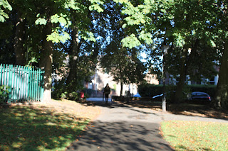
This shot is a long distance shot which has connotations of being far away and it makes the audience wonder who the girl is in the distance and what she is doing. I think it is well composed because the girl is in the centre of the image and there is a path leading up to her so this is naturally where your eye line will take you. However, the lighting is not very good where the girl is which makes it difficult to see her properly, it would have been better if the girl had come forward a little into the the light as this would have made it easier to see her properly. I used a manual focus which to work the actual ring I did not find difficult, however I did keep forgetting to use the focus as I had never used it before and so I was not used to working with it. I did learn to remember to make sure the images were in focus and so this helped to improve the quality of my images greatly. I do think that perhaps this image could have been more in focus as you can see a slight blurring in some areas, however as this was a long shot image I do not think it affected the image too badly. I did not use the zoom in this particular image as it was not needed for the type of shot I wanted to create.

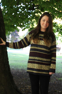
The type of shot used here is a medium long shot as it is take from above the knees and also allows the audience to see the the environment around the girl. I do believe that it is well composed as it shows some of the environment around her, the lighting is good and it is in focus. Used the manual focus for this picture and I think it worked really well to ensure that my image was in focus and did not blurr. This image is in focus due to the use of the manual focus ring. I did use the zoom on this particular image because when I previously took an image of the same place I thought that you could see too much of the environment and I wanted the image to focus mainly on the girl, therefore I used the zoom so that I could have the right amount of environment in the background but not too much to over power the girl. The eye line in this image is in the top third of the image, therefore it shows her importance and superiority in the image, as she is the main part of the image this is the connotation I wanted to aim towards.

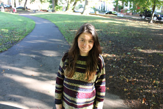
The type of shot I have used here is a medium shot and I have taken the photo as if I am looking down at her. This gives the connotation that she is inferior. I think that it is well composed as it is in focus, she is in the centre of the image and I have used a type of shot that gives out certain connotations to the audience. However, I do think that this image may have been better in portrait instead of landscape. This is because I believe that there is too much environment around her which makes you focus on other things around her and not entirely on her. I used the manual focus ring on this image which ensured that it was not blurry. On this image the focus ring was not difficult to use as I was close up. I did not use the zoom on this image because I did not need to use it for the shot that I was wanting to take.

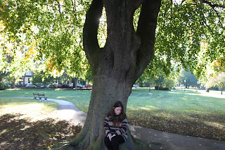
For this image, I wanted to use the rule of thirds to create connotations of inferiority and so I had the girl sit under a tree at the bottom of it. This meant that she was at the bottom of the tree and so her eye-line would be in the bottom third showing how inferior she is. I do believe that this image would have been better if it had been in portrait and just included the tree and not the environment around it. Therefore in the future I would take this into consideration. I used the manual focus on this image which meant that it was in focus. It was not difficul to use the focus ring on the camera as over time I have gotten used to using it. I did not use the zoom on this image as I did not believe that it was relevant or required to the image I was taking.

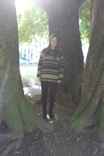
This image is a long shot and I also tried to use the trees to frame the girl in the image. In order to do this I asked the girl to stand behind the trees so that the trees would stand infront of her and frame her. I don't beleive that this image is very well composed due to multiple reasons. I do not believe it is very well in focus, the lighting is not very good and the girl looks misplaced as she is slightly off centre. I did use the manual focus on this image, however it was difficult to see whether the image was in focus due to the bad lighting that can be seen behind her. Therefore this image was not in focus and this is something that in the future I need to be aware of so that I can find another way to take the image but using better lighting. I did use the zoom in this image because I wanted to ensure that the tree's framed the girl and so to do this I had to ensure that they was no environment seen next to the tree's.
Overall, I do believe that there are alot of strengths with my images, however I can also identify some weaknesses. The first strength is that the majority are well composed, the girl is in the centre and the images are well lit and not blurry. This ensures that the pictures are of a good quality. In addition, I believe that I have used the rule of thirds well so that the it shows certain connotations. However, the weakness that I have identified is that I need to think more about whether my images would look best in landscape or portrait. Also I need to think about the environment around the image and how it affects the image. I also need to think more about lighting and how the natural sunlight will affect my images. Overall, I do believe that the images I took were very good, however I have identified some problems that I need to think about in the future in order to ensure my images are of a good quality.


