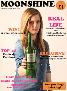
The first job I had to do was setting up my page sizes and then inserting my cover image into this document. I did not face any problems whilst doing this and so this was a relatively easy first step. I also had to place my guides into the document so that everything would look neat and match up together.
Next, I decided to begin adding the sell lines and the heading of the image. I firstly did the heading and the price. There were no problems doing the heading, but I did have some difficulty with the price sign. This was because the writing in it could not be changed when I wanted it to, therefore to solve this I found out that I needed to click on the text icon before I could actually change the writing. This knowledge will also help me in the future for when I am wanting to change the text. Other than this issue, that was quickly resolved, I did not face any problems up until this point.
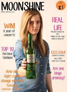
I then continued to add the sell lines on to the front cover. I experimented with different 3 colour pallettes and this was the one that I am going with for now. Although this may change in the future, I think that the colours do work together and stand out on the cover well. They are also quite girly colours which relates back to my target audience of 16-19 year old females. I decided to change the heading colour from the blue to black because I thought that this stood out more. The sell lines I used aim to entice the readers to buy the products, this means that I have used a lot of exclusivity lines and involved them in a lot of them by using 'you' a lot. I did not face any problems doing this as it was very similair to previous tasks I have completed.
The final task that I completed this week was changing the fonts of the sell lines of my front cover. When I first placed the sell lines in, I just wanted to get a feel of where everything was going to be placed on the cover. Therefore now I have decided where abouts they will be placed I can now change the fonts to those that I have downloaded.
Next week, I plan to continue and hopefully complete my front cover. I need to manipulate the image of the bottle so that the label reads 'Your future is in the bottle' and I will need to change the fonts so that they stand out more, as it is difficult to read some of the sell lines. I also think that some of the gaps need to be filled in. These are the tasks I am planning to complete next week.


No comments:
Post a Comment